Showing posts with label card-making. Show all posts

Saturday, April 6, 2013

"Pooh," whispered Piglet... -- UPDATED

Hi, everyone.

This week's CAS-ual Fridays challenge is to make a card that uses chevrons and flowers. Talk about a challenge! My craft room is about as chevron-free as a craft room can possibly be. :(

Then I remembered the gorgeous Mama-razzi Bo Bunny paper pad I just picked up at my favorite LSS, Scrapbook Art.

After I decided on the paper, I thought this might be the perfect time to use a favorite quote from A. A. Milne. I bought a little Hallmark knickknack with this saying years and years ago. Every time I see it, I think of my dear, dear friend Linda. Linda and I met during our first teaching assignments and we've been friends for over 30 years. She was the matron of honor at our wedding. And, no matter how long it's been since we've talked -- or how how far away she's moved, we're always there for each other. Now that I think about it, it's really appropriate that I'm writing this on her birthday. [Hmmm... The only question is which of us is Pooh and which is Piglet. Linda's actually a huge Tigger fan!]

dp: Bo Bunny Mama-razzi, edges washed in watered-down Americana Light Buttermilk acrylic
ivory Prima flowers painted in watered down Americana Light Buttermilk and Fawn acrylics
Mark Richards' and Queen & Co.'s pearls painted in watered-down Light Buttermilk

computer-generated sentiment: Mistral, 16 point, charcoal gray RGB (8, 8, 8)
Creative Memories circle/oval cutting system
PLEASE SEE BELOW FOR UPDATED CARD!

  •  My first step was to print the sentiment on a piece of 6 by 6 paper. One of the changes I would make is to lower the placement of the sentiment just a little so it fits more on the lighter part of the paper. But, I'm still mastering that skill. Better luck next time!
  • The edges of the background paper were painted in watered-down acrylics. Think I've found a great way to get that antique look in any color I want. :)
  • The chevrons were fussy cut from a piece of the Bo Bunny paper.
  • Two flowers were painted in acrylics. The top flower is Fawn with Light Buttermilk accents. The bottom flower is a Light Buttermilk/Fawn mix, while its edges are dabbed in Fawn.
  • The flower's center pearl, and the 3 tiny pearls in the top left, are painted in Light Buttermilk. 
  •  Elements were placed touching one another, keeping in mind the rule of thirds, to create a strong focal point.
  • Finally the oval was placed so that the pattern aligned with the pattern of the background pattern.
What most excites me about this card is how the painted flower and pearls turned out. I have a huge collection of acrylics from my tole painting class days. It's fabulous to know I can make these embellishments any color that I want them to be!

Happy birthday, Linda!  Looks like I have next year's card already done. :)

Updated Card

Since first posting this card, I added a few more embellishments: three tiny pearls at the bottom of the sentiment oval and two leaves to the left side of the flower. 
  • The added pearls were also painted with Light Buttermilk. 
  • The leaves were hand cut from Distress Ink core paper. Veins were hand drawn using a Zig pure brown pen, and they were painted with watered-down Americana Red Violet and Americana Celery Green acrylics.

I'm really liking the look of the leaves. And, the three pearls in the oval nicely ground the sentiment. But, I think they're responsible for the shadow in the scanned image.

Parting Thoughts

Headed over to Operation Write Home and check out their Spring Training Tutorial Day for making masculine cards.

As always, thanks for stopping. Happy weekend and happy scrappin'!

Wednesday, April 3, 2013

A Tag for Dad -- UPDATED

Hi, everyone.

Hope the week is going well.

The card below is for today's Midweek Throwdown challenge to make a card featuring a tag and some twine. It's actually one of the cards I made when I was offline last week. Great timing for the MWT!

Moxxie VIP Father, Distress Ink core; Celebrate It! jute twine
EK border and hole punches

Sounds like OWH needs some Miss You cards. Maybe I can make one of those tonight.

Update

Got that Miss You card made after all. Nothing groundbreaking here -- just a card that could be sent to/from a man or woman. I've seen this sentiment a number of times on other cards and thought it would work well here. Thanks to fellow card-makers for this idea.

dp: Momenta; tan cardstock: AC Neutrals
gray cardstock: Cardstock Warehouse Paper Co., other cardstock: stash from ???
Celebrate It jute twine; 3D dots
sentiment: computer-generated in Arial; 20 pt; R: 43, G: 68, B 149

Parting Thoughts

Again, many thanks to those who have complimented the bubble wrap background. Lee Mae, the rock guitar card using three Distress Ink colors that you posted a couple of weeks ago was actually one of the inspirations for that tutorial. :)

As always, thanks for visiting and happy scrappin'!

Sunday, March 31, 2013

God Bless You for Serving

Hi, everyone.

Happy Easter. Hope you have enjoyed a blessed Easter celebration with family and friends. Hubby and I went to church with hubby's dad. Then the three of us met up with my dad for an early dinner.

Today's card, which was inspired by today's OWH sketch, seemed a fitting tribute for one of our heroes on Easter Sunday.

Bo Bunny Liberty, Bazzill Admiral and Watermelon, stash brown cardstock
Stamper's Best sentiment stamped in Adirondack espresso
Fiskars and the Paper Studio star punches adhered with 3D glue dots, garage sale brads

Other than moving one of my "circles" to the bottom right corner, I stuck to the sketch. (Maybe there's hope for me yet!)  And, I'm still loving that new Stampin' Up! trimmer.  :)


Parting Thoughts

A huge thank you to everyone who left such kind comments about "The Sky's the Limit" bubble wrap card and "Feeling Blue?" ombre card. An extra special thanks to Nancy for featuring the bubble wrap technique in this week's Tuesday Tutorial.

It's really great to be back online. I was out of town -- and offline -- last week. But, I did have a few card-making supplies with me. Had a chance to make a few dad cards. Hope to share a couple of those in the next few days or weeks. :)

Thanks for stopping and have a great week! Happy scrappin'!

Wednesday, March 20, 2013

Feeling Blue?

Hi everyone,

A quick post for today's Ombre Midweek Throwdown. I also tried to keep in mind this month's Design Bootcamp focus on the rule of thirds.

acrylic-painted background: Desert Turquoise, Light Ivory, Midnight Blue
sentiment from Inkadinkado's Kid Quotes, heat embossed in Distress Ink black soot
paper: Distress Ink core paper, black Cardstock Warehouse Paper Co., white AC
Queen & Co. rhinestones

Before scrapbooking/card-making and after cross-stitching, I took classes on tole painting. (Does that make me a serial crafter, as Bobbi likes to say?) And, I've been looking for ways to incorporate painting in my card-making. Today's challenge seemed like the perfect opportunity to do just that!

The middle painted strip is Desert Turquoise. The strips on the left and right are blends of Desert Turquoise with Midnight Blue and Light Ivory, respectively. I must admit that I really like the way this technique turned out. :)

The sentiment background is also slightly ombre, with the bottom layer being a sanded version of the orange layer.

Parting Thoughts

When I asked hubby to take a look -- or in hubby speak, "if he was ready for an eye-rolling moment" -- I told him the challenge was an ombre one. His loving response was, "Is that hombre with an H?" He's a funny one, he is. :)

Okay, I really do think this is my last card post for a week or so. Think the schedule is going to require that I be semi-offline these next few days. But, this challenge was too much of a temptation to pass up. Jan, thanks so much for such a fun challenge!

So, have a great end-of-the-week and weekend. Thanks for stopping by and happy scrappin'

Monday, March 18, 2013

Q: When does 1/3 + 1/3 = 1?

A: When you place an element one-third from the left and a second element one third from the bottom to create one great card!

If you haven't yet checked out Paula's Rule of Thirds post for this month's OWH Design Bootcamp, be sure to take a look. Paula is sooooo rocking design bootcamp!


Paper: Bo Bunny Liberty, Core-dinations Vintage, Bazzill Admiral
sentiment from Paper Inspirations heat embossed in Distress Ink vintage photo
garage sale brads

I really LOVE this card -- so CAS and so elegant! I decided to go with a white background for the sentiment so it would really pop -- and I placed three little brads next to the sentiment to draw just a little more attention to the sentiment portion of the card.

Parting Thoughts

 Thanks again, Paula! Who knew bootcamp could be so much fun?

This is probably the last post for a week or two. May have a chance to make a few cards, but probably not to blog about them.

Have a good rest of the week. Thanks for visiting -- and happy scrappin'!

Sunday, March 17, 2013

For Our Everyday Heroes

Hi everyone,

Surprise, surprise! I found a little time to make an Any Hero card after all. And, since Mother's Day cards need to be to Operation Write Home shippers by the end of March, I have a card fit for a super mom -- or 15 super moms, to be exact -- to share.

Card 1: A Star-Studded Tribute

OWH Sketch #164 is the inspiration for today's Any Hero card.

dp: We R Memory Keepers Red, White and Blue; Bazzill Admiral; rust cardstock: ???
Sentiment from Stamper's Best in Stampin' Up! Night of Navy; Recollections brads

The card came pretty easily -- and I am still LOVING this new Stampin' Up! trimmer!

Card 2: The Adventures of Supermom

Talking about everyday heroes, who doesn't owe a huge thank you to their mom? A while ago, the word "Supermom" popped in my head and I just couldn't shake it. After quite a bit of mulling, tinkering, and revising, the card below was born. About 15 of these were shipped to Kris a week or so ago.  :)

cardstock: AC; sentiment: computer-generated (Comic Sans); lots of fussy cutting
Inside sentiment: "Promoter of truth, justice, and the American way"

What I love the most about this card is that hubby was a huge collaborator on this one. His suggestions were key to the phrases that ended up the card. Since neither of us were sure that today's heroes would be familiar with the opening of the "old" television series, hubby suggested creating phrases that mimicked the original opening lines as closely as possible. Another big help was his assistance in picking out just the right cardstock colors.

My typical Mother's Day cards are usually pretty girly. I'm hoping a few heroes might appreciate this change of pace.

Another atypical aspect of these cards is that I included an inside sentiment. Almost all of my OWH cards are completely blank on the inside to allow for as much writing space as possible. The inside sentiment of "Promoter of truth, justice and the American way" also mimics an opening line from the television series.

Suffice it to say these cards were pretty labor intensive. And, I was struggling with a less than cooperative trimmer. But, I really felt that the cards were well worth the effort -- and hubby and I were both very pleased with the end results!

Parting Thoughts

Not sure there will be much card-making this week. But, the following week looks promising!

Thanks for visiting. Have a great week and happy scrappin'!

Saturday, March 16, 2013

Got Chipboard?

Hi everyone,

Today's cards were made for this week's CAS-ual Fridays challenge to make a card using chipboard. I actually played with two different ideas. While I'm pleased with both results, I won't be sending either card to Operation Write Home -- the first one because of the glitter and the second because of its sentiment.

Card 1: 24-7

The inspirations for this card were the sentiment, which I had seen on another card somewhere before, and a set of silvery-glittered alphabet/number stickers.

Distress Ink core, heat embossed with Distress Ink and Stamp N Stuff silver powder; stash silvery cardstock
Tools: Sizzix ef, circle template, The Paper Studio circle punch, the new Stampin' Up! trimmer;
adhesives: 2-way glue,  mini glue dots, pop up glue dots

The heat embossing was done by first applying embossing ink to the inside of the embossing folder. The heart's scalloped edge was a final embellishment because the card felt like it needed a little something more. After playing with ribbons, gel pen accents, and metallic paper twist, I settled on this scalloped effect. The scalloped edge is actually a series of punched circles, punched from some yummy silvery cardstock. They added the extra oomph this little heart seemed to be missing.

I know that the elements are a little more fussy than what you typically see on CAS cards, but the layout is CAS-inspired. So, I'm calling it CAS and sticking to my story. LOL

A note to my fellow OWHers: I applied the stickers downstairs -- far away from the craft room -- and then put the card in a protective cellophane sleeve as soon as it was finished. :)

Card 2: One Day at a Time

This card was actually inspired by a card we made at Thursday night's Stampin' Up! class and by a previous CAS-ual Fridays challenge to create your own background. Wish the colors showed up a little better on this scanned image.

Cosmo Cricket Blackboard; sentiment by Jillian Vance, stamped in StazOn
Distress Ink tumbled glass, scattered straw, dusty concord applied using dryer sheets and a mini mister

black cardstock: Cardstock Warehouse Paper Co, blue cardstock: Distress Ink core

What really excited me about this card is that the background was created with used dryer sheets. I tried several different methods for applying the ink. The method that seemed to work best was rubbing the dryer sheets on the ink pads, misting them with water, and dabbing the ink on the cardstock. (Excess water can be blotted up using a paper towel before applying ink to the cardstock.)

The sentiment was stamped first using StazOn jet black ink. Chipboard images were placed to be pointing skyward, and the yellow ink was purposely placed directly above the higher dragonfly.

Again, I really wish the colors showed up better because I really like the end result of this dryer sheet technique.

Parting Thoughts

Hoping to get a chance to make an Any Hero card for tomorrow's OWH sketch, but there's a pretty long to-do list before I get to crafting.

Still LOVING the new Stampin'Up! trimmer. It is fabulous!!!

Thanks for stopping. Enjoy the rest of the weekend and happy scrappin'!

Friday, March 15, 2013

Is it really possible to love a trimmer?

Because I think I do!

Hi, everyone. Welcome back!

Last night I went to a card-making class hosted by a sweetheart of a Stampin' Up! Demonstrator. The class was free if you purchased the new trimmer for $25. I thought how could you beat a deal like that? Surely, I'd be needing a new trimmer sometime in the future. 

We used our new trimmers in the class. And to paraphrase a movie line, "It had me with one cut!" Seriously, this is by the far the best trimmer I have EVER used! And, we made four adorable cards, to boot! Maybe I just need to get out more often, but I had such a fun time. LOL

new, FABULOUS Stampin' Up! trimmer
4 adorable cards made during the class

Parting Thoughts

Hoping to make a card or two for this week's CAS-ual Fridays challenge tonight, but I'm only cautiously optimistic about that happening.

Thanks for visiting and happy scrappin'! And, have a great weekend.

Thursday, March 14, 2013

The Road Less Traveled By

Hi everyone,

The card below was made for this week's OWH Midweek Throwdown to make a card featuring blues and greens.

patterned paper: Momenta 6 x 6; DCWV, brown/black paper: DCWV Travel Stack, green: Distress Ink Core
computer-generated sentiment, inked in Distress Ink antique linen
tools: crimper, EK Success border punch; embellishments: garage sale brads

This design is one I've used a number of times before. What's different this time is that I took a long and winding road to get here. :)

My original plan was to make a card using the ribbon brad trick featured in this week's OWH Tuesday Tutorial. I had the cutest little travel brad to use -- which is why I choose these papers. Unfortunately, the ribbon was too flimsy and the brad was too big. So, I decided to go with a crimped strip behind the sentiment, as well as adhering the sentiment off-centered to allow for the brads on the left. But, when I placed the elements together, the card still seemed a little too plain. That's when I cut a strip off the front of the card and added a little more pizzazz with the border punch.

All in all, I'm okay with the way this little card turned out -- and it certainly fits the Midweek Throwdown color challenge. I was just a little surprised by the journey it took to create it. :)

Parting Thoughts

Gotta go! But, I can't wait to tell you about tonight's card-making adventure. Hoping to get a chance to blog about it tomorrow. :)

Until then, thanks for stopping and happy scrappin'!

Sunday, March 10, 2013

A Perfect Pair

What's a perfect pair, you ask? A great OWH Sketch and a couple of good college basketball games! Who could ask for more to craft away a couple of hours on a Sunday afternoon? Throw in a long walk on a sunny day... Seriously, who could ask for more?  :)

And, it's always interesting to me how some sketches come so easily and others not so much. Luckily, this was an easy one for me. :)

Card 1: Pop, Poppa, Daddy, Dad

dp: Moxxie Father; cardstock: Distress Ink core, inked with Distress Ink Vintage Photo
PSX Creative Characters in Adirondack espresso
Celebrate It! jute twine; pop up dots
Creative Memories square punches

Looking at all of the green and brown paper left in my Distress Ink core pad, looks like I need to make a few more of these masculine cards. :)

Card 2 -- Today's Any Hero Card: Red, White, and Sparkly

dp & chipboard letters (with baked-in glitter) Bo Bunny Liberty
cardstock: Bazzill Admiral
, Distress Ink core

These chipboard letters are really thick. So, they seemed like the perfect embellishment for an Any Hero card.

Card 3: Hello, Cupcake!

dp: Imaginisce Hello, Cupcake!; cardstock: Distress Ink core; ivory rickrack
Cuttlebug ef; cupcakes fussy cut from coordinating 12 by 12 paper

Since there are several April birthdays on our calendar, I made a second one of these for a friend.

Parting Thoughts

My last post featured a card with one of those adorable kid quotes. Sharon commented that she uses those sentiments on the inside of cards and had never thought of using it for color blocking on the front of a card. That's really interesting since I seldom stamp sentiments on the inside of cards. Most of my cards are sent to Operation Write Home. So, I leave the inside of them blank so troops can write notes to loved ones back home. What a great idea to use these stamps as inside sentiments for cards made for my family and friends. Thanks, Sharon!

As always, thanks for stopping and happy scrappin'!  Have a great week!

Saturday, March 9, 2013

Dad, Papa, Daddy, Hero


Tic Tac Toe 001 


Hi everyone,

Tonight's card was inspired by this week's Midweek Tic Tac Toe challenge. I went with Stars, Tags, and Blue.

Since I mailed Mother's Day cards to Kris this weekend, thought it was time to start on some Father's Day cards.


dp: Moxxie VIP Father; cardstock: blue: Cardstock Warehouse Paper Co; green &  tan: Distress Ink core paper
sentiment: Stamper's Best in Stampin' Up! Night of Navy
star punches: Martha Stewart and The Paper Studio; hole punch: EK Success
Celebrate It! jute twine; pop up dots for tag and star

When I first read the challenge, I thought this was going to be an easy one. But, boy was I wrong. And, although it was more of a challenge that I expected, I'm really pleased with the way this Father's Day tribute turned out.

Parting Thoughts

If  you haven't had a chance to check out today's OWH's Blog Skip featuring three new stamp sets designed by OWH's own Sandy Allnock, it's definitely worth your while. So many cute cards and so much inspiration!

Hoping to get a little more card-making done tomorrow.

Thanks for visiting and happy scrappin'!

Friday, March 8, 2013

Kids Say the Darndest Things

Hi everyone,

I'm really excited that I had a chance to make a card for the weekly CAS-ual Fridays challenge on Friday! This week's challenge is to use blocks of color.

black cardstock: Cardstock Warehouse Paper Co,, cream cardstock: Bazzill or AC
sentiment: Inkadinkado Kids' Quotes heat embossed in Distress Ink black soot
Cuttlebug ef; color block inks: Distress Ink tumbled glass blending into Distress Ink scattered straw
blocks mounted using pop up dots


Love the way the colors transitioned. Of course, blue was a natural choice based on the sentiment. So, I decided to go to yellow to paint in a happier color. Then I decided to pop the colors even more by placing them on black cardstock.

I am typically frustrated when my edges aren't as precise as I would like. Let's just say that my trimmer is not behaving as well as I would like. But, in this case, the unevenness of the cuts really adds to the kid-like feel of the card. :)

Hope this one will bring a smile to one of our hero's loved ones.

Parting Thoughts

Hoping to get to this week's Midweek Tic Tac Toe challenge tomorrow.

Have a great weekend! Thanks for visiting and happy scrappin'!

Thursday, March 7, 2013

Round and Round They Go

Hi everyone,

Today's post features two cards with circular objects.

ODBD Challenge

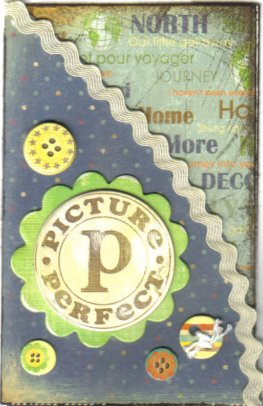
When it came to choosing a scallop for this month's OWH ODBD challenge, I had two chipboard elements from which to choose. When I remembered my pad of travel-themed paper, the Picture Perfect element won.

Momenta dp; K & Company Wild Saffron Adhesive Chipboard; ivory Ric-Rac
techniques: inking with Adirondack Espresso

To make this card, I flipped the sketch on page 136 of Card Sketches for Paper Crafters. Since this card ended up being only 3.5 inches wide, I'm going to use 12-by-12 inch cardstock instead of 8.5-by-11 inch paper if I make any more cards from this sketch for OWH.

Tuesday Tutorial

Today's second card also features circular objects. I actually made this a while ago at a day-long crop. At the crop, a Stampin' Up! consultant led some make-and-takes using the Spirelli technique featured in this week's Tuesday Tutorial

designer paper and oval punches: Stampin' Up!; cardstock: Bazzill; DMC floss; stash embellishments

I loved the way the technique turned out. However, I decided this little flower was too delicate  to make the trip overseas and back. So, instead of sending it to OWH, it is going to be hand delivered to a friend celebrating an early April birthday.

Parting Thoughts

Next two items on the crafting to do list:
Thanks for stopping. Happy weekend and happy scrappin'!

Sunday, March 3, 2013

God Bless You for Serving

Hi everyone,

Two posts in one day!!!  It's so nice to be enjoying a respite from an intense work schedule. :)

Today's Any Hero card was inspired by OWH Sketch #162. I made the jute strip a little longer than shown on the sketch. Other than that, I think the card follows the sketch pretty closely.

Bazzill Admiral and Bo Bunny Liberty; jute
sentiment from Stamper's Best, heat embossed in Distress Ink barn door
star punch: The Paper Studio

Parting Thoughts

Hoping to make a card for this month's ODBD challenge later this week.

Thanks for visiting. Have a great week -- and happy scrappin'!

Wednesday, February 27, 2013

WILD About You

Hi everyone,

When I first saw today's OWH Midweek Throwdown, I had no idea what I would make. Then, I remembered a croc embossing folder and some animal print paper -- and the card below was born!

Midweek Throwdown Recipe:
embossing folder: Sizzix
border punch: EK Success
2 patterned paper: BasicGrey 12 by 12 pad
1 piece of jute twine
(sentiment: computer-generated (Andy font); paper and twine inked with Adirondack espresso)


I must admit, I'm pretty wild about the way this tag turned out -- and everything about it is hand-crafted. :) 
  • The sentiment is computer-generated and printed on the back of a piece of Core-dinations Vintage paper. 
  •  The core paper was mounted on two "solid" papers from the same BasicGrey pad.
  • Each layer of the tag is inked with Adirondack espresso.
  • The jute twine was also pressed into the Adirondack ink. It is double knotted and "secured' with a dab of glue on the back of the tag.
  • Finally, the tag was adhered using 3D glue dots.
My initial thought was to add a few brads. However, I decided to leave the tag and card exactly as shown.

Hope a hero is as wild about this card as I am. :)


As always, thanks for visiting and happy scrappin'!

Sunday, February 24, 2013

Taking a Stand

Hi everyone,

Last night, I watched On the Waterfront for about the 100th time. Boy, when Hollywood gets it right, it really gets it right. Must be why I love watching the Oscars so much. :)

So, I think I was drawn to the sentiment on this week's Any Hero card because of Marlon Brando's and Karl Malden's portrayals in this magnificent film.

dp: Bo Bunny Liberty, browns: Core'dinations Vintage, blue: Bazzill Admiral, white: Bazzill or AC
sentiment: Stamper's Best heat embossed in Distress Ink Vintage Photo; garage sale brads
Creative Memories cutting system


For the card above, I tweaked the sketch. (Although, hubby could actually see the sketch in this one. Maybe there's hope for me yet!) I rotated the sketch 90 degrees, used a circle instead of an oval for the sentiment, and went with 3 brads instead of 2.

I'm really liking the way the blue and brown combo turned out. Love the texture of the core paper. Hoping one of heroes will feel the same way.

Parting Thoughts

Thanks to Paula for some helpful Focal Point feedback.

Think I need to get in a nap this afternoon to make it up for the Best Picture award. lol :)

Finally, will probably cut out elements for some Mother's Day cards while cheering on the hometown team during an afternoon college basketball game.

As always, thanks for visiting. Have a great week and happy scrappin'!
Saturday, February 23, 2013

A Wisp of Silver

Hi everyone,

This week's CAS-ual Fridays Challenge is to create a CAS project that has a touch of silver. So, I thought this might be a perfect time to return to a couple of the challenges posted during last weekend's OWH VCMP.

Those of you who joined in the fun may remember the card at the right. It combined two of the challenges: a multi-layered card in only white and/or cream and a glitter-flee glitz/glam card.

As much as I loved the card, I was concerned that it may not be very mail-friendly for our heroes to send home. So, I decided to use this CAS-ual Friday challenge as an opportunity to make a more mail-friendly version.

DCWV Christmas & Winter Combo silvery matstack paper, AC white cardstock
Cuttlebug ef; Martha Stewart punches; Mark Richards crystals; tulle
(Sorry the image isn't brighter, but it's pretty clear -- and an accurate representation of the colors.)


I just love the elegance of these white-on-white and cream-on-cream cards. Talk about some lovely wedding and anniversary cards. While this silvery version would be perfect for a 25th anniversary, it would be so easy to change colors to commemorate other milestone anniversaries.   :)

Parting Thoughts

Planning on working on some Mother's Day cards tonight -- and maybe piecing together a few more patriotic hearts. Hoping to make an Any Hero card tomorrow using OWH's weekly sketch.

Thanks for visiting and happy scrappin'!

Thursday, February 21, 2013

Focal Point Hearts -- Takes 2 and 3

Hi everyone,

First of all, thanks to all those who hosted stops on last weekend's VCMP!  The challenges were so much fun!

And, thanks to everyone who visited here. Special thanks to those who left comments. The patriotic chevron card and the diffused-embossed gear card seemed to be the crowd favorites.

I'm so excited that I won the blog candy at the Desert Rose Stamper -- whose challenge was to make a card in white and/or cream. Looks like some lovely lace and embellishments are headed my way!  :)

Focal Point Card -- Take One

cardstock: AC and Distress Ink core; original heart pattern created in Word
tools: Sizzix ef, crimper, sander; embellishments: Recollections brads

Note: Wish the image did justice to the colors. The red is a much richer red.
The brads are a much deeper blue, about the same color as the cardstock.

I posted the card at the right for OWH's Design Bootcamp Focal Point Challenge. Silly me... I actually thought it had a strong focal point. :)

While Paula agreed that her eye first went to the heart element, she felt a little "tension" with regard to the
3 stars.

She suggested that a larger blue rectangle around the heart element might help make that element an even stronger focal point.

Focal Point Card -- Take Two

Aside from swapping out the brads, I kept most of the elements exactly the same in the card below. (I did have to use a slightly different neutral because I was all out of the one used on the first card.) 

As you will see, I tweaked the dimensions of several of the elements. Even though I'm waiting official word from Paula, this focal point feels much stronger to me. But I'm wondering if it's possible for a focal point to be too strong... And, if yes, is this focal point so strong that it is overpowering?


Focal Point Card -- TakeThree

For this week's Midweek Throwdown Fun Folds Challenge, I made a brad-less version of the card, again keeping many of the elements the same. I did add a red square behind the heart element to tie in the red of the heart.

This card feels like it has a really strong focal point. But, it seems like it might be easier to make a strong focal point with a symmetrical card. 


Parting Thoughts

So, what do you think about these three cards? Is there one that appeals to you more than the others? What is it that you like about it? (Hubby's review was the same for all three -- "nice".)

I loved how all three of this week's OWH posts were interrelated: Design Bootcamp Focal Point,Tuesday Tutorial featuring techniques that produce strong focal points, and Midweek Throwdown Fun Folds that can produce strong focal points. Nice job, Paula, Nancy and Jan!  :)

Working from home tomorrow. So, it feels kind of like the weekend. Hope your weekend is a good one.

Happy scrappin'!  

Monday, February 18, 2013

My Heart Beats Red, White, and Blue

Hi everyone,

Time for Day 2 of Design Boot Camp!  This month's topic is creating a focal point. Maybe it's just wishful thinking but, as I look at all of the cards I created for our VCMP, I really believe this is a part of design theory that I've come to do pretty well.   :)

So, let's put this theory to the test. Paula mentions that our card should showcase a star that is supported by the other card elements, much like the star of a film is supported by the other actors in the cast.

In the card below, my intent was to cast the paper-pieced heart in the starring role. To accomplish this:
  • I double framed the heart using (neutral) tan and deep navy rectangles as its base. 
  • The red strip was placed to run under the center of the rectangles to bring focus back to the heart. (The red strip was crimped and embellished with brads to add a little extra interest.) 
  • These elements were placed on top of white to pop the colors. (The white rectangle was embossed for a little contrast and added interest.) 
  • I used navy for the card base to connect the card background with the heart. 
  • For further continuity, I used the same cardstocks for all of the white elements and all of the red elements throughout the card. 
cardstock: AC and Distress Ink core; original heart pattern created in Word
tools: Sizzix ef, crimper, sander; embellishments: Recollections brads

Note: Wish the image did justice to the colors. The red is a much richer red.
The brads are a much deeper blue, about the same color as the cardstock.

I've actually been tinkering with this idea for awhile. The design is an original, created using shapes in Word. Its inspiration was the heart in Sweet Stamp Shop's God Bless America stamp set.

I'm pretty pleased with the way this little heart turned out. So, don't be surprised if you don't see it starring in a couple more cards in the days to come.  :)


 Parting Thoughts

Since the colors of Ohio's state flag are red, white, and blue, think I'll also post this card for this week's Midweek Throwdown.

Looking forward to seeing the other focal point cards in this session of boot camp. Thanks again, Paula, for being our camp instructor!

As always, thanks for visiting and happy scrappin'!

Saturday, February 16, 2013

Paper, Tools & Techniques... Oh, My!

Hi everyone,

Excited about this weekend's OWH Virtual Cardmaking Party? I know I am.


star paper, chevron paper, word search: We R Memory Keepers Red, White & Blue
cardstock: red: Bazzill watermelon, blue: ???; stars: Recollections brads
techniques: crimping, fussy cutting


This challenge inspired me to use one of those patterns and one of those small embellishments in the paper pad that hadn't initially called to me. Thanks, Erika!

Thinking this is a card that might appeal to a pre-teen.


paper: Core-indinations Vintage collections; butterfly: K & Company adhesive chipboard
embellishments: Queen & Co and Mark Richards pearls; flea market & scrap ribbon by/from ???
technique: embossing with Sizzix folder; tools: Creative Memories cutting system, corner rounder
I can never resist the opportunity to make a butterfly card. Misty's challenge gave me the perfect reason to use this adorable butterfly chipboard sticker. Thanks, Misty!

It seems like a daddy might be sending these butterfly kisses to his little princess. :)


green/gray paper: Distress Ink core, black: Cardstock Warehouse Paper Co, brown: AC;
embellishments: garage sale brads;
techniques: selective embossing with Tim Holtz folder; heat embossing with Distress Ink Black Soot and clear powder;
inking in Distress Ink Black Soot, Distress Ink Vintage Photo, Stampin' Up! Bravo Burgandy, Stampin' Up! Going Gray
sentiment: Jillian Vance; adhesive: 3D glue dots

Oh my gosh -- I've seen this technique used on cards and wondered how it was done!  Thank you, Beth, for sharing this with us! 

One note about the card: I originally placed brads at the center of the gears, but felt the gears were starting to look more like flowers. So, I added additional brads -- going for a few clusters of 3 -- to bring back the "manliness" feel of the card. Hubby said it was "nice", which is pretty high praise from Mr. Stoic. :)


Summer Rule No. 7 tag: My Mind's Eye garage-sale bargain
blue paper: Distress Ink core; brown and green paper: Core-dinations Vintage core
circle and hole punches, sanded for distressed effect
inking in Distress Ink Vintage Photo, Distress Ink Peeled Paint, and Distress Ink Tumbled Glass
paper: BasicGrey inked in Distress Ink Vintage Photo and Distress Ink Antique Linen
Martha Stewart butterfly punches; Creative Memories cutting system
Queen & Company and Mark Richards Pearl; Cuttlebug Swiss Dot embossing folder

It's ironic I have two cards for this challenge because I really do not have many winged things in my stash upstairs -- a fact hubby would find rather unbelievable! Thanks, Yvonne, for helping me spread my wings for this challenge. 

What I really like about the first of these cards is that it's a change of pace for me. I've had this adorable tag, which was 10 cents at a garage sale, for several years. Guess it was waiting for just the right challenge to come along! I also like how the sanded circles mimic the circles on the tag.

The second card is more of a typical card for me, although I don't often emboss patterned paper. Hubby preferred this one. :)


paper: Moxxie Father 12x12 and AC Neutrals cardstock 8x8; Cuttlebug ef
sentiment: Stamper's Best heat embossed with Distess Ink Vintage Photo
star punches: The Paper Studio and Fiskars; garage sale brad
inking in Distress Ink Vintage Photo and Close to My Heart Desert Sand


What a great challenge!  I never would've thought about getting 6 cards from one 12 by 12 sheet. And, I seldom make multiples.

However, confession is good for the soul. I had to cheat a little on this one. The only 8.5 by 11 cardstock I have is Bazzill Admiral and Watermelon -- to go with my cherished Bo Bunny Liberty paper. But, I went with the spirit of the challenge and made 6 cards from this one 12 by 12 sheet of Moxxie paper. :)

Oh, my sentiment strips are not the specified dimensions for the designated sketch... and I moved the sketch embellishments. It just felt right to place the stars on the right side to balance out the vertical strips.


dp and star sticker: Bo Bunny Liberty; cardstock: Bazzill Admiral and Watermelon
star brads: Recollections

Love the sketch!  This week's Any Hero card really came together quickly once I decided upon the dp for the background. Decided against the sentiment rectangle after placing the star on the white paper.

Can't get enough of these cute little star brads I found on sale at Michael's this past week. Just wish the center part of my card didn't look like it's sliding downhill. Why don't these things ever look so obvious on the card? :(


cardstock: AC; computer-generated sentiment
tools: Creative Memories cutting system, hole punch
Okay, I have so few wheel-related items in my stash. But, I found stickers from long ago. So, I went online, did a search of truck birthday parties, and came up with the idea of yellow and black diagonals. Various party sentiments provided a spark of inspiration and the card text was born. Kind of stumbled on the gray and orange papers through experimentation. Finally, I decided to go with just black punched holes to kid-friendly focal accents

Thanks, Linda, for inspiring me to create my own wheek-related background to go with my few stickers. :)


DCWV Sweet matstack; SEI Happy Day die cut accent
stash ribbon (with cute polka dots); Mark Richards crystal sticker pearls
tools: Creative Memories cutting system, Fiskars border bunch
technique: inking edges in Close to My Heart Desert Sand
Jen, you had me at chocolate. Thanks for hosting!  :)

For those new to OWH, the glitter on this card is okay. Papers with baked-in glitter, like some DCWV and SEI lines, are okay to use. The "Can I scrape it off?" test is a good test to use. 


Sharon's All White & Cream and Kaylee's Glitter-Free Glitz and Glam Challenges

White & Cream cardstock: AC; Cuttlebug ef
embellishements: Queen & Co and Mark Richards pearls, cream tulle

I never, ever would have thought of doing a 3-layered card in all white or cream. And the results are so elegantly CAS. I'm really loving this monochromatic look. (Wouldn't this make a beautiful wedding card?)

For Sharon's challenge, the layers are: bottom embossed white base, cream rectangle, and a white rectangle with a scored border. I went with pearled butterflies and tulle for the embellishments.

After I embossed the butterflies, I thought about adding a tiny pearl for every embossed dot -- channeling my inner Sandy, I suppose! This seemed like a perfect way to incorporate Kaylee's glam challenge. While it makes for an interesting effect, I'm thinking all the pearls might be too much to send in the mail. So, I'm thinking of replacing the top butterflies before I mail this to Kris -- maybe going with just a few pearls in the center of each butterfly.

Thanks to both Sharon and Kaylee for hosting such creative challenges.


Making Memories Packing Tape; Core-dinations core paper
computer-generated sentiment; garage sale brads

technique: sanding

I seem to be saying this a lot during this card-making party, but I did not have any  washi tape in the menopause (aka craft) room -- mainly because I had no idea what to do with it. However, I did have some garage-sale packing tape that I had not yet opened. So, in the spirit of the challenge, I went with that.

After seeing Donna's great sample card and the wonderful linked cards, it looks like I'm headed to my LSS to pick up some washi tape. Thanks, Donna, for showing some of the cool things that can be done with a little tape!

Parting Thoughts

Wow! That was so much fun! With the recent demands of work, it'd been a long time since I've had a couple of days to devote to cardmaking. So glad I was able to do that this weekend.  :)

Thanks to OWH's very own Allison for organizing our party and to all of the cardmakers who hosted challenges. And, thanks to all of you who visited and/or left comments.

Looks like it's time for Design Boot Camp. It appears Paula has a focal point lesson for us!  
Happy scrappin'!